
The Pantone Color of the Year
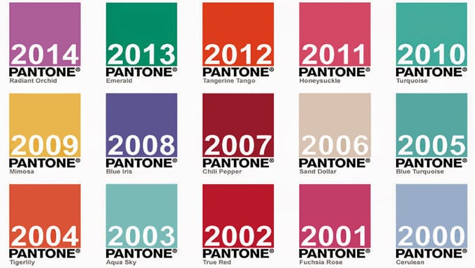
The big topic of conversation in the design arena every year is the Pantone Color of the Year. It’s an annual color trend which is incorporated into countless design plans and a valuable resource for anyone working with color. Whether your reaction to the annual color choice is positive or negative (I’m personally not a fan of the 2021 colors), Pantone’s influence in the world of color is very impressive and undeniable.
So, who or what is Pantone? Well, I’m glad you asked…
The Pantone Color System is the most important color matching system in the world. The system originated in 1963 to solve the problem of complicated color matching in the printing industry.
Soon after, Pantone became the easiest and simplest way to classify, communicate and match colors with the use of a color catalog in a fan format.
Every color, in every tone and tint, was given a numbered classification. Pantone literally wrote the book on color matching. For over 40 years, Pantone has been the go-to color matching system for not only the design industry but also paint, textile and plastic manufacturers.
Now that’s truly impressive!
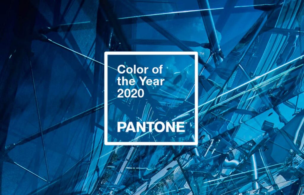
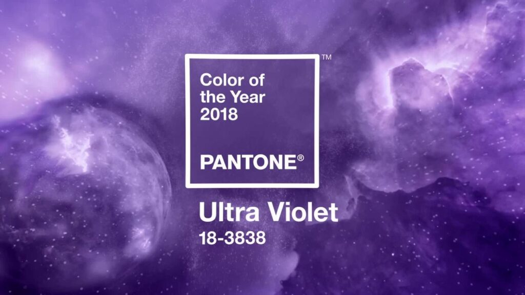
Do you have a favorite Pantone Color of the Year? 2 of my favorites are the Pantone Color of the Year 2018: Ultra Violet and the Pantone Color of the Year 2020: Classic Blue.
Comments are closed